Author Archives: Harry Bernard

Buying Gems on The Internet; Picture Perfect

by Richard W. Wise, G.G.

©2012

Everyone is familiar with the old sayings; seeing is believing and a picture is worth a thousand words. In the internet age, however, I'd suggest prospective gem buyers embrace another old saying, "believe half of what you see!" Yes, thanks to Photoshop coupled with the ability to select a broad range of lighting options at varying color temperatures, a picture can tell a thousand lies.  Despite this, gem buying on the internet has increased a thousand fold aided by a crop of gem forums where hobbyists, prospective grooms and gem collectors gather to share information and critique gems on offer.

Many of the participants in these forums believe that a gemstone is just another commodity that qualities are uniform and prices follow some sort of median so that if most of the 1 carat sapphires they see online are $3,000 a carat then any stone with a price tag above that number is, by definition, expensive and overpriced.    As I have said in my book, Secrets of The Gem Trade, and other places, this is simply not true.  The prospective buyer who limits himself to images and median prices is doubly mistaken assuming that quality is his goal.  This myth is reinforced by largely untrained  online gurus who claim the mystical power to judge the quality of a gemstone by simply evaluating an image and by consumers who simply want to believe them rather than doing some of the tedius work of actually comparing stones.

As gemstone approach theoretical perfection in color/cut/clarity and crystal, smaller differences in those criteria make for larger and larger differences in price.  At the same time, those subtle difference are extremely difficult to capture in an online image.  An image can tell a lot about a gemstone with regard to clarity and color, I can often see enough to pass on a given stone, however, I cannot see enough to make a firm buying decision.  From this point on, actual comparison is absolutely essential.

Unrealistic Expectations:

Of Off center Culets and Tilt Windows:

The Making of a Masterpiece VI (Part 2)

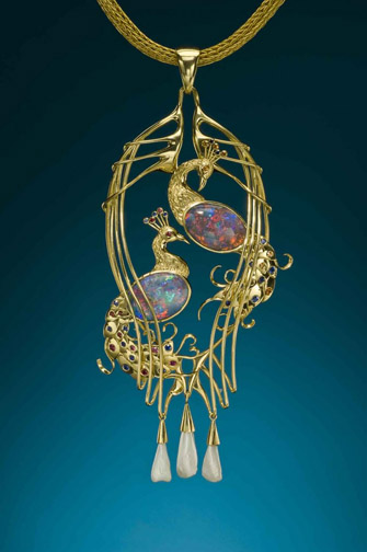
The finished pendent, steps in making follow.

The finished pendent, steps in making follow.

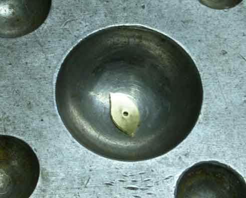
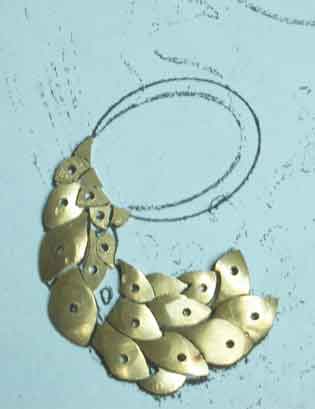
The wing is constructed of separate elements to give it maximum definition. Here an individual "feather' has been cut out, drilled for the gem and is prepared to be domed.

The wing is constructed of separate elements to give it maximum definition. Here an individual “feather’ has been cut out, drilled for the gem and is prepared to be domed.

DappingBlock1


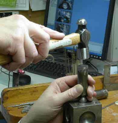
Here goldsmith Michael Corneau uses a steel punch to curve a single feather of the bird's wing.

Here goldsmith Michael Corneau uses a steel punch to curve a single feather of the bird’s wing.

Ancient Technique of Sand Casting:

Truly handmade jewelry is made in the ancient manner using the metal itself.

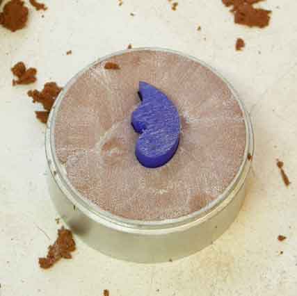
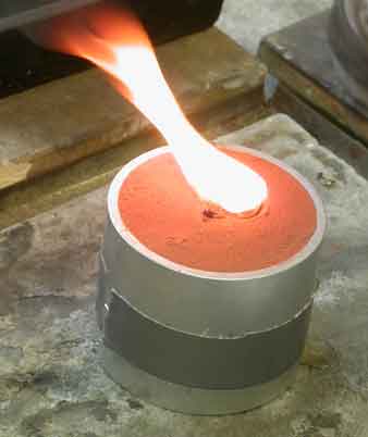
Modern commercial and some so-called handmade pieces are actually carved in wax and then cast using the cire perdue or lost wax process.  The more ancient method is sand casting.  The approach is similar, a model is made and it is impressed into a crucible.  In each case the molten gold is poured into a vacancy.  Once a mold is made, lost wax can be used to produce multiples.

The total time required for Michael Corneau to produce the Peacock Pendent was 212 hours.  This did not count, of course, the time spent developing the concept, discussion and selection of gemstones.

WaxInSand

PouringGoldSand

Sand casting the peacock’s body: Molten gold is poured into the depression made by removing the model from the sand.

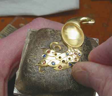
Setting the gems: Once the feathers have been dapped out and soldered together and the cast body has been finished and soldered to the tail, gem setting can begin, the method is known as thread and bead setting.Peacock Pendant: Micro view, all gems set.

Setting the gems: Once the feathers have been dapped out and soldered together and the cast body has been finished and soldered to the tail, gem setting can begin, the method is known as thread and bead setting.Peacock Pendant: Micro view, all gems set.


by Richard W. Wise, G.G., A.S.G. ©2012 all rights reserved.

Treasures from Trash, What is Art?

Head of The Phoenix.  The total length of this sculpture by Chinese artist Xu Bing is 110 feet.  The weight, 12 tons.

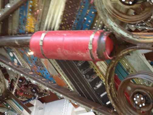
Head of The Phoenix. The total length of this sculpture by Chinese artist Xu Bing is 110 feet. The weight, 12 tons. The head is a commercial jack hammer. Photo: R. W. Wise

by Richard W. Wise, G.G., A.S.G.

©2013 all rights reserved.

At 110 Feet long and weighing in at 12 tons each, the artist Xu Bing’s Phoenix Project currently on view at Massachusetts Museum of Contemporary Art is impressive.  It is particularly interesting given my last post in which I asked questions regarding art and the use of precious materials.

Once you get beyond the shear size of them, what is particularly striking about the twin bird sculptures suspended from the gallery ceiling, is the fact that they are totally built from construction waste.  That’s right junk!

In my last post, I showed a beginning series of images of a 4 x 1.75″ Peacock Brooch constructed of 22k gold, 18k gold, black opals, rubies & sapphires and asked the rhetorical question, can a piece of jewelry constructed out of precious materials be considered art?  Many critics hold that the jeweler’s art, if it is art at all, is a minor one.

So, when my wife Rebekah and I walked into the gallery Sunday, what to my wondering eye did appear but a huge, in fact two huge works of art made exclusively of junk, the very antithesis of or you might say the other side of the coin.  Junk had obviously been used as a material to create art, what did that say about the use of gold and gemstones?

Close up of the wing of the Phoenix, note the use of various types of waste found around construction projects.  Xu Bing lived in the U. S. for many years, when he returned to China he was struck by the magnificence of some of the new buildings going up contrasted with the dwellings of the poverty striken workers who built them.  Photo:  R. W. Wise

Close up of the wing of the Phoenix, note the use of various types of waste found around construction projects. The artist used re-bar, flashing, discarded gas bottles and shovel blades among other things to construct his birds. Xu Bing lived in the U. S. for many years, when he returned to China he was struck by the magnificence of some of the new buildings going up contrasted with the dwellings of the poverty striken workers who built them. Photo: R. W. Wise

The first thing that struck me as that the constructions themselves were quite beautiful.  It was necessary to focus, to draw the mind away from the contemplation of these wonderful works of art to be able to discern the method and materials of their construction.  First you see the whole, only later the parts.

What makes a material precious?  It is largely a question of attitude. Gold has been valued from the beginning of recorded time.  You need only to see and touch a natural gold nugget to understand the material’s appeal.    First the color, in its pure form, gold is a striking orange-yellow.  Its weight is reassuring, its touch sensual.  Are these attributes simply too seductive to the senses, do they submerge the artist’s intention and make it impossible to convey meaning?  Certainly it doesn’t help.

Given the tactile and visual qualities of gold and the connotations of wealth associated with it, it is clearly impossible for anyone to view the object qua object without reference to the material of its construction.

When you view Xu Bing’s Phoenix you are struck by his achievement.  When we view the Peacock Brooch are we simply overwhelmed by its glitter?

All That Glitters; The Peacock Pendant:  22k gold, 18k gold, opals, rubies, sapphires, spessartite garnets and natural Mississippi Pearls.

All That Glitters; The Peacock Pendant: 22k gold, 18k gold, opals, rubies, sapphires, spessartite garnets and natural Mississippi Pearls

Still, there is no denying the beauty and appeal of the Peacock Pendant.  Each bird appears to float, each has a distinct attitude, the tiny gems twinkle in the light and the peacocks magnificent  tails’ wrap themselves provocatively around a golden bower.  They eye is, of course, drawn to the center stones.  The two opals exhibit a fabulous flashing pallet of color.

NEXT POST, The Making of a Masterpiece VI (Part 2) MORE IMAGES, STAY TUNED.

.

The Making of a Masterpiece VI (part 1)

22k/18k hand fabricated Peacock Pendant. The piece is accented with two black opals from the Moonshine Field at Lightning Ridge as well as rubies, sapphires, natural Mississippi pearls and spessartite garnets. Designed and handmade by R. W. Wise, Goldsmiths, Michael Corneau, designer/craftsman.

22k/18k hand fabricated Peacock Pendant. The piece is accented with two black opals from the Moonshine Field at Lightning Ridge as well as rubies, sapphires, natural Mississippi pearls and spessartite garnets. Designed and handmade by R. W. Wise, Goldsmiths, Michael Corneau, designer/craftsman.

by Richard W. Wise, G.G., A.S.G.

©2013  all rights reserved.

What is art and is the work of the goldsmith an art at all or merely a craft?  This is an ancient debate.  Some would argue that the use of precious materials, as opposed to more mundane materials, such as paint and canvas disqualifies the metalsmith and his product from the status and stature of the fine artist.  Jewelry is all about the materials, gold, platinum, gemstones, design being viewed as a secondary concern.  The objective of the goldsmith, is to decorate the body and decoration is not art.

That the piece pictured left is decorative cannot be denied.  Its inspiration hails from the Art Nouveau Movement (1900-1910), with a design iconography that evolved out of the Arts & Crafts Movement, which paradoxically stressed the use of simple non-ostentatious materials and hand craftsmanship.  Like Arts & Crafts jewelry, Art Nouveau jewelry utilized naturalistic design,  but whereas Arts & Crafts practitioners emphasized the use of unusual and relatively mundane non-precious materials,  Art Nouveau eschewed the ideological and abandoned the mundane but retained the emphasis on the naturalistic embracing a a more feminine, sensuous vocabulary partially through the use of precious materials.

It is no mistake that the Art Nouveau Period parallels what has become known as The Gilded Age—neither saw anything wrong for sumptuous decoration for its own sake.  Plato reduced art to beauty.  Is decoration art or is it something else, I guess you will have to decide.

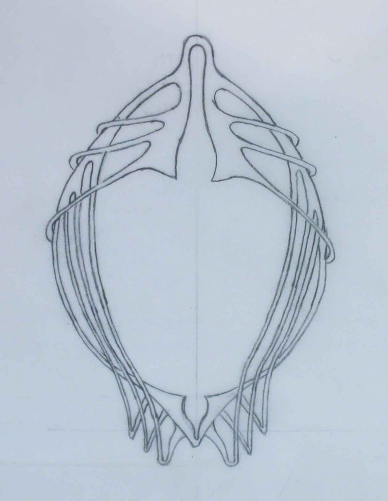
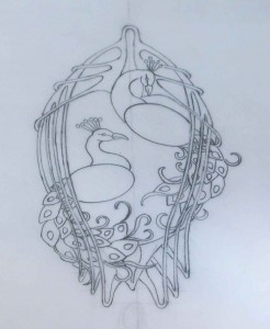
As is often the case, we began with a client, a magnificent pair of black opals and an idea.  We worked with the client over several months.  The following images illustrate far better than any words the development of the concept.

Birth of  A Concept:

The concept began with a pair of black opals the two peacocks, a perennial part of the Art Nouveau design lexicon.  The peacock has been used as a symbol from the time of the ancient Greeks.  However, in this case, it seemed particularly useful as a naturalistic excuse to show off the the bird’s plumage using a rainbow of colored gemstones.

Second Preliminary sketch.

Second Preliminary sketch.

Completed sketch.

Completed sketch


Accenting Color

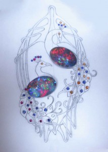
Finding accents for gem opal is always a challenge.  Very few gemstones find a simpatico with opal.  In this case; ruby and blue sapphire worked very well, picking up the corresponding hues in the opals, but when it came to the orange tones in the opal, orange sapphire and diamond simply did not work.  The only gemstone that the opal would accept was spessartite garnet. Here is the preliminary

layout:  In the next post, I’ll share some more images including the steps involved in the hand manufacture of this beautiful pendant.  Stay tuned…

PeacockGemLayout3


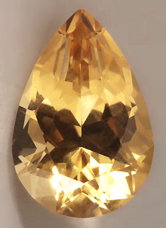
Natural Heliodore, Golden Beryl from Connecticut

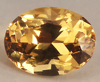
10986:  2.11 Carat pear shaped brilliant cut with exceptional vivid color and crystal.

10986: 2.11 Carat pear shaped brilliant cut with exceptional vivid color and crystal.

by Richard W. Wise, G.G.

© 2012  All rights reserved.

10987 A 1.74 Carat ovall brilliant heliodore from the Roebling/Merryall MIne, Litchchfield, Ct.  The gem exhibets an exceptional vivid medium toned golden hue.

10987 A 1.74 Carat oval brilliant heliodore from the Roebling/Merryall Mine, Litchfield, Ct. The gem exhibits an exceptional vivid medium toned golden hue.

Golden Beryl; An American Gem

In the 19th Century, the state of Connecticut was known as a major source of golden Beryl.

In the past few years a fair amount of golden beryl a.k.a.  heliodor has entered the gem market.  Material currently in the market is coming from Pakistan, Brazil and Ukraine and although there is no reliable gemological test that will prove irradiation, much of this material is thought to be enhanced by gamma radiation, a method that leaves behind no footprints.  Of late there have been misguided attempts to cash in on the gem's more famous sibling by re-labeling the gem as "yellow emerald."

The continental United States is not known for its gem wealth though historically both California and especially the New England states have  produced some exceptional gems.  In the 19th Century, Maine was known as a repository of gem quality tourmaline, some beryl and amethyst.  Most of the gems found in New England are of pegmatic origin the result of long super-hot magmatic fingers working their way up through cracks into the country rock causing localized melting into a chemical stew and its constituents, where beryllium oxide was present,  might reform into beryl crystals.  Many of the most important strikes were found in Maine including the famous Mt. Mica Mine which resumed operations in 1990 after a long hiatus.  Pegmatites are found in all the New England states excluding Rhode Island and are particularly numerous in Maine and New Hampshire.  Gem mining was in most cases simply a byproduct.  The mines were mainly exploiting mica, Beryllium and feldspar.

Beryl is a family name whose best known offspring are emerald and aquamarine.  If a beryl is pink it is known as morganite if red it is called bixbite or simply red beryl.  In the 19th Century, golden beryl was quite rare and Connecticut was considered a major source.  The term heliodore, from the Greek meaning "gift of the sun" was originally a trade name made up to describe yellow beryl from Southwest Africa.

"A Gift from the Sun," Gem Mining in Connecticut:

Few realize that the George Roebling or Merryall Mine located in Litchfield County, Connecticut was, historically, one of the most productive and commercially important gem mines in the United States.  This mine opened in 1880 as a feldspar and mica mine and worked intermittently until 1955 when it was closed.  According to the late John Sinkankas, Merryall is known to have produced particularly fine beryl in shades of blue, yellow and green including a 40.44 blue-green heart shaped gem that now resides in the Smithsonian.  The mine produced some sizable aquamarine, but most of the heliodore production was limited to very small faceted gemstones.

We recently acquired a few particularly fine rough examples of natural unenhanced heliodore, portions of a single large crystal, sourced at the Roebling/Merryall Mine site from a pile of unsorted mine run material in the early 1980s.  The crystal was inside a large boulder.  This material has been precision cut into a few lovely heliodore gems.  These gems are flawless to the eye, exhibit a particularly fine crystal structure, a high degree of transparency and a vivid pure yellow hue and perfectly cut by our lapidary.

10987 Rough material from which the 1.74 carat oval, 10987, was cut.

10987 Rough material from which the 1.74 carat oval featured at the beginning of this post, 10987, was cut.

As Sinkankas points out, very little of the material sourced from this location is of gem quality never mind eye-flawless material.  Mine run material containing 1% Beryllium is considered a rich deposit.  Gems from this site have not been on the market in many years. For the gem collector, this is an or for the jewelry lover looking for a lovely vivid yellow gemstone, this is an opportunity to buy American and acquire a particularly fine gem from a truly rare source.

Gemstone Cut Grading; Distinctions Without a Difference II

by Richard W. Wise, G.G.

©2012 all rights reserved.

Of Tilt-Windows, Off-center culets and other minor issues:

255.1

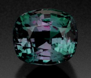
The image of the gem quality 1.44 carat alexandrite might lead the uncritical observer to conclude that the gem is windowed. What the gem is actually exhibiting is some extinction beneath the table. In a perfect world, both are minor faults, but we are talking about the rarest gem on earth. In the world of true rarity, beauty not mathematical perfection of symmetry is the ultimate criterion.

The first time I ever heard  the term tilt-window was on the Pricescope forum.  As you know, a window is a part of the gem when viewed face-up that exhibits transmitted light.  Windows are almost always found right beneath the table.  A quick test is to place the stone over a piece of newsprint.  If you can read the print, you are looking through a window.  Windows are the result of a shallow pavilion, a too shallow depth to width ratio.  Windows are considered faults because they are a portion of the gem that does not sparkle.

Gem cuts are designed and engineered to be judged face-up with light perpendicular to the table.  Tilt the gem away from the perpendicular and every gem other than a briolette will exhibit a window. Ironically the more precise the cut, the more likely the gem is to window when tilted as little as five degrees from the perpendicular.  Some gems, particularly those with a bit of fat around the pavilion, may exhibit some brilliance when tilted as much as ten to fifteen degrees from the perpendicular.   What cannot be eliminated must be embraced.   A tilt window, forgetaboutit!

Grading; From Minus To Plus:

Gems with bulbous pavilions are often criticized for being overweight, meaning that the stone’s face is smaller than it would be if the stone was perfectly cut.  The irony here is that such stones may actually exhibit a greater arc of brilliance which contributes to the beauty of the gem.  Once the eye is four to five feet from the gem, the overall brilliance becomes the real issue, not the stone’s mathematical diameter.    Broader bellies also extend to the length of the light path and may enrich the  color (hue, saturation and tone) of the gem.

In another Pricescope thread, one ubiquitous poster put a link to an alexandrite (pictured above) on my website and criticized me for the failure to disclose an off-center culet.  How did this forum member determine that the stone had such a terrible fault?  The page included a side view image of the stone face-down.  If there was an attempt to hide the fault, it was hidden in plain sight.  http://www.rwwise.com/products/id,255   Unfortunately her interpretation of the image was quite wrong.  The stone does not have an off-center culet.  What the forum member saw was a very minor symmetry fault, one side of the pavilion has a slight indent coupled with a tilted crown which when placed on a flat surface caused the culet to appear off-center.  And if the gem did have a slightly off-center culet, so what!  We are talking about one of the earth’s rarest treasures, a gem quality alexandrite!

Each Gem Is an Individual with a distinct personality and should be judged on its merits:

Gem aficionados usually begin their love affair with the colorless diamond.  They learn the famous 4 C’s and attempt to apply those criteria, namely color, clarity cut and carat weight uncritically to colored gemstones.  As I have said elsewhere all Cs are not created equal.  In the connoisseurship of colorless diamond, cut is the 1st and most important criterion.  Diamonds have no color, they are all about  brilliance and sparkle, so naturally cut, which delivers sparkle is the most important single criterion.  I knew a neophyte jeweler once who was not satisfied with eye-flawless sapphires, he demanded that all of his sapphires be flawless under 10x magnification.  The problem, without inclusions it is almost impossible to determine if a stone has been enhanced and determination of geographic origin is absolutely impossible.

Colored gemstones as their name suggest are all about color and cut is, at best, a secondary consideration.   An off-center culet in a diamond would be a major symmetry fault and materially effect price.  In a colored gem, an off-center culet in and of itself is a minor fault which has no effect on price.  Why do such things exist?  A culet might appear off-center for a couple of reasons.  The lapidary may have removed a potentially eye visible inclusion or have placed the culet slightly askew to smooth out color zones so that the zone does not appear in the gem when viewed face-up.

It should be remembered that colorless diamonds are not truly rare.  The introduction of cut and clarity scales that have nothing to do with beauty are more about creating the appearance of rarity than the thing itself.  The connoisseurship of gemstones requires discernment and careful contemplation.  Gems cannot be accurately graded by image.  The aficionado should beware attempts to reduce it to a formula or a check list.

Gem Cut Grading; Distinctions Without A Difference

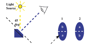
The diagram shows the proper angle for viewing an asymetrical gemstone.  The bottom half of the gem is evaluated, the gem is then turned 180 degrees and the other half is judged for percentage of brilliance, the two percentages are then totaled.

The diagram shows the proper angle for viewing an asymetrical gemstone. The bottom half of the gem is evaluated, the gem is then turned 180 degrees and the other half is judged for percentage of brilliance, the two percentages are then totaled.

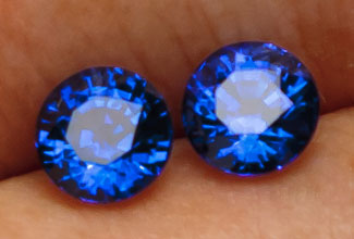
This matche pair of carat sized blue sapphires exhibit off-axis refraction also known as extinction.  The dark areas move as the gem moves partially defilning the positive areas of scintillation

This matched pair of carat sized blue sapphires exhibit off-axis refraction also known as extinction. The dark negative areas move as the gem moves partially defining the positive areas of sparkle (scintillation) in the gems

I wandered over to one of the major gem forums this morning.   One of the members was talking about a phenomenon he called “shadowing.” This poster defines shadowing when a gemstone exhibits brilliance across half the stone when the stone is held off axis, that is not perpendicular to the light source, he was looking for a cure.

A Non-Issue:

This is a good example of a non-issue.  Non-symmetrical cuts, rectangle, oval, pear viewed under a single beam light source will always show brilliance across half the face of the gem when the stone is tilted away from the perpendicular. Why, because the gemstone is not symmetrical and therefore treats light in a non-symmetrical fashion. In the cuts just mentioned, some facets particularly the pavilion facets which are responsible for delivering brilliance, cannot be uniform.   Some are larger, some are longer therefore light hitting these facets will refract in an irregular fashion.  Symmetrical cuts, rounds and square cushions, by contrast have uniform facet patterns and do not suffer this phenomenon.

For this reason, asymmetrical gems are graded under a single light source, viewed at at a 45 degree angle away from the light source angled toward the eye.  At this viewing angle, half the gem, the bottom half is potentially brilliant.  The percentage of that half is then compared with the other half when the gem is rotated 180 degrees and viewed a second time.  Add the relative percentage of each half and voila you have the total percentage of brilliance.  In colored gemstones, 80% brilliance is considered excellent which means that at any given time, 20% of the gem will exhibit extinction.

One trick for viewing the brilliance of the entire stone at once is the use of sky light.  Turn your back to the sun and view the gem at the same 35 degree angle toward the eye.  In this position the light filtering around the body of the viewer should light up the 100% of the gem.  Any lack of brilliance in this position is a fault and should be subtracted from the theoretical 100% to arrive at the percentage of brilliance.   In most cases, gem photographers correct for this phenomenon by photographing gems with non-symmetrical  outlines by using  multiple light sources.

A Little Extinction Contributes To A Gem’s Beauty

Extinction is another much misunderstood phenomenon. I am often asked, particularly by members of this forum, if a particular gem shows extinction. First lets define our terms, what is extinction. This phenomenon is caused by off-axis refraction. When light enters a gemstone, it enters the crown and reflects internally off the pavilion (back) facets and eventually back through the crown to the eye. Inevitably some light refracts at an angle that is not toward but rather away from the eye, the greater the angle the more extinct it becomes, in a tonal continuum from gray to black.

All faceted gemstones without exception exhibit extinction, no extinction, no scintillation. the great German philosopher Hegel said determinatio est negatio. which when reduced to simplest terms means g all positive requires a negative.  Sweet has no meaning without salty, good does not exist without evil, etcetera.  So too with gems. Scintillation, sparkle is the result of light being broken up into pieces, tiny scintillas of light that are refracted back to the eye in little pieces. Between those pieces is darkness, extinction. Want a gem to light up like a flashlight with no sparkle, eliminate extinction.  Some degree of extinction is therefore required as contrast.

Extinction As A  Fault:

Extinction can have other causes as well, dark is the absence of light.  Gems lacking transparency will often show what one of my clients once called a “heart of darkness” at the center of the gem beneath the table.  This is particularly prevalent in sapphire and the cutter will often cut a window to let in light through the culet, the apex of the cone shaped pavilion of the gem.  So while some extinction is desirable, in fact necessary to the beauty of the gem, large areas of extinction are a definite and definable fault.

Evaluating Gem-e-Wizard; Gem Grading/Pricing Software

©2011 by Richard W. Wise, G.G.

First off, Gem-e-Price is the first grading/pricing software that I have evaluated and working with it was a lot of fun.  With the recent addition of colored diamonds, Gem-e-Price is now able to offer a price structure for just about all species and varieties of colored gemstones.

Gem-e-price offers three ways to approach the evaluation/pricing process.  I say evaluation because, although gem-e-price is sold as pricing software, the ability to select quality is a necessary precondition for determining price.

Ease of Use:

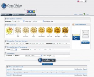
The software is easy to use.  First you are presented with a fairly clean screen with buttons and drop boxes.  There are three tabs;  Fancy Search, Price List and Price Calculator.  The default screen, Fancy Search allows you to select a gem variety, size, shape, weight, clarity, treatment.

Gem-e-price Home screen

Gem-e-price Home screen showing range of colors in yellow diamond.

Unfortunately it didn’t take long for the first bug to appear.  Once you select “color” (primary hue) and “modifier” (secondary hue) and move on to shape, you quickly realize that though you can select your shape from a graphic series, only two shapes will actually appear in the gallery, select round or square cushion, choose any other shape and square cushion is shown.

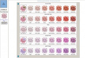
The images, which in the colored diamonds section covers the basic grades, fancy through fancy dark,  are not pictures of actual gemstones or photographic images at all, they are graphic representations.  When I first saw these during the introduction of gem-e-price for colored gems, I referred to them as grading by cartoon.  However, one function of the software helps overcome this lack of veracity to some degree.  Once the color has been selected, say yellow, the “Fancy Ruler” button to the right will take you to a screen with a spectrum representing all colors, from there a “Select Color” button in the center of the screen takes you to a new screen with all permutations of the given color (hue): brownish yellow, brown yellow, orangy yellow and so forth.   You get a good relative overview of what the graphic range is supposed to represent and is useful for honing in on the appropriate nuance of color.

Gem-e-price screen showing range of primary and secondary hues in pink diamonds.

Gem-e-price screen showing range of primary and secondary hues in pink diamonds.

It also provides you with a more or less universally accepted color descriptive  shorthand, e.g. VpB (vivid purplish blue).  I should add that you are able to upload, at the home screen, an actual image of the diamond that you wish to compare and that image follows you from screen to screen.

Nomenclature Issues:

Is the pricing accurate?  As Shakespeare said, “aye, there’s the rub.”   The answer is yes, no and sometimes.  I compared the Gem-e-price with a couple of my own diamonds, then called colored diamond expert Stephen Hofer author of Collecting and Classifying Coloured Diamonds and compared various price lists, pink, gray and blue diamonds generated by the Gem-e-price software.  The prices made no sense at all until in a conversation with Gem-e-price developer, Menahem Svedermich, he revealed that the price is pegged fairly low.  This will require a bit of explanation.

The point I make in my book, Secrets Of the Gem Trade, is that all fancy vivid diamonds are not created equal.  GIA’s colorless diamond grading system has 24 grades, the GIA colored diamond grading terminology has only between 5-7 depending upon the hue.  These are fancy light, fancy, fancy intense, fancy vivid, fancy deep and fancy dark. In the vivid category, for example there can be high, medium and low vivids depending upon the saturation/tone of the hue.   Gem-e-price assumes a 1-5 saturation grid at each level and pegs its price to level 2.  Why not the median?  Good question!  Well, one week later, Gem-e-price has been updated, it now sports three price levels for each color grade, Regular, Fine and Extra-fine categories and these have helped to better define price levels.

Pricing Accuracy:

With Hofer’s help I took a look at a one carat Fany Intense Pink  diamond( FIP).  A two thousand dollar spread, in pink diamonds, hardly worth mentioning, the price was spot on.  I then went to a 0.70  FVY-O from my own inventory.  This is a problem stone, The GIA grading report calls it Y-O, to me its a orangy yellow (oY).  So, I tried it both ways.  The Yellow-Orange price was way out of the box, the Orangy-Yellow was pretty close to my actual cost.  Next I tried a 1.75 Fancy Intense Blue IF which Hofer described as a top stone.  The Gem-e-price was between under Hofer’s price by between 100-200,000 per carat—sounds like a lot but we are talking blue diamonds here so it is fair to say that Gem-e-price is in the ballpark.  I did some further work, switching over to colored gemstones I priced out emerald, ruby and sapphire.  The emerald and sapphire prices came out in the zone, the ruby price, we are talking super-unheated-gem in one carat sizes came out very high.  I asked Antoinette Matlins author of the second best book on colored gemstones—opps there goes my Bonanno award—she checked my price and reported results that were similar to mine.

Overall Evaluation:

Overall I like it.  Is it perfect, no!  It is designed for professionals, in the hands of someone without a wealth of experience it could be a potential disaster, but then what isn’t?  Gem-e-price is a useful tool, its got a few bugs, but it is getting better, Svedermich and his team made adjustments as I worked and will, I am sure, continue to improve the product.  I like the price grids!  A subscription with monthly updates is $300.00 per year and, in my opinion, well worth the price.

Kashmir Sapphire, Another Auction Record

by Richard W. Wise, ©2011

Dateline: Hong Kong

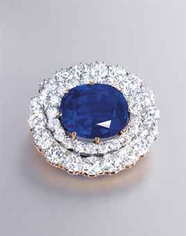
Current world record holder, 26.41 Carat Kashmir Sapphire

Current world record holder, 26.41 Carat Kashmir Sapphire Courtesy: Christie's

A New World’s Record:

November 29th, Christie’s Auction House, Hong Kong, sold a 26.41 carat Kashmir sapphire for 3,838,508 or $145,342.00 per carat.  This sale establishes a new world’s record price of Kashmir sapphires sold at auction, besting the former world’s record also established at Christie’s (New York) for the 22.66 carat Hill Sapphire which sold in April 2007 for $3,064,000 or $135.216.00 per carat.

Kashmir sapphires were originally found on a small hillock 13,000 feet up in the mountains of the now disputed Indian state of Kashmir in 1881-1882.  The harsh conditions at this altitude meant that the mines could only be worked about one month per year.  By 1887 the output of the mines had diminished substantially.  The original lessee abandoned the diggings in 1905.  Four other groups had a go at it with little success and the sites were more or less abandoned in 1928.  A bit of material is still occasionally found, alluvial material at the bottom of the ridge, but the major production of Kashmir sapphire lasted a mere six years.

Kashmir stones are highly esteemed for their color, a vivid purplish blue, a hue often described as “cornflower blue.”  Others, most notably Richard W. Hughes, author of the seminal book Ruby and Sapphire, describe the finest color as a Pepto Bismol bottle blue.  The problem with this characterization is that Pepto Bismol bottles are now pink—but there are those of us who are old enough to recall when the bottles were a bright medium blue. I recall seeing only one stone of this description and it hailed from Sri Lanka.

Kashmir’s famous characteristic, however, is the silky, milky or fuzzy texture that somewhat diminishes the diaphanity (crystal) of the stone.  Myriads of tiny inclusions that resemble dust caught in a ray of sunlight or  a sub-microscopic milky way, will, when present, diffract and refract the light, causing the stone to take on a velvety glow.  Similar inclusions are sometimes found in gems from Madagascar and Sri Lanka, but absent geographical certainty, these “Kashmir type” sapphires do not command nearly the price of those with old mine provenance.   The current record holder was accompanied by four laboratory reports certifying Kashmir origin.   This, of course, begs the question:  If gems are all about beauty and sapphires from other locations have all the characteristics of the finest Kashmir, why does anyone care where the stone is from?  The short answer is branding.  The market recognizes a value in stones from the original mine.   It is also fair to say that although stones can be found with the characteristic glow, very, very few approach the pinnacle of Kashmir color.  I have only seen two stones that can be described as #1 Kashmir color and both were from the old mine.

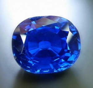
What a difference a light makes, record breaking sapphire before re-cut, note the large culet visible through the table. Photo courtesy Stone Group Labs.

What a difference a light makes; the current record holder before a re-cut shaved a single carat. Note the large culet visible through the table and the characteristically velvety texture or crystal. Photo courtesy Stone Group Labs.

Rapidly Escalating Prices:

Kashmir prices have been increasing steadily since the late 1980s.  According to connoisseur and author Benjamin Zucker, a twenty carat fine quality Kashmir sapphire was worth $25,000 per carat in 1976, though I recall an exceptional stone that sold at auction in the early 1980s for $12,500 per carat.  By the turn of the last century prices for extra-fine examples at auction passed $100,000 per carat.   Pricing must be taken with a grain of salt.  Given varying qualities, the vicissitudes of auction houses, and the lack of any real standardized grading system, it is difficult to compare stone to stone.

Prices for premium gemstones, fancy color diamonds, type IIa colorless diamonds,  ruby, sapphire, emerald and lately spinel,  have all increased markedly since the 2008 bust.  This can be traced to a lack of confidence in paper currencies, generally, and the dollar and Euro in particular.

Connoisseurship–Opinions Vary:

Bear Williams of Stone Group Labs, the first gem laboratory to evaluate the new record holder, was impressed.  “My hair kinda stood up on end, it had some sort of magic,” he said describing his first look at the sapphire.  When Williams saw it, the stone weighed over 27 carats before it was re-cut slightly and re-polished.   From all indications the stone is quite superior to the Hill Sapphire, which American Gem Labs President Christopher Smith described as a “nice stone.” in 2007.  Smith rated the former record holder, the Hill Sapphire, at an 8-8.5 on a 1-10 scale. Williams puts this new one well into the 9s, “maybe a 9.8” he says.  Chris Smith at American Gem Labs, who did a full quality evaluation, gives the stone an overall Total Quality Integration Rating (TQIR) of Exceptional and a color grade of 2.5 (1-10 scale).  Note that AGL’s TQIR factors in rarity, together with quality factors.  A five carat Kashmir or the same quality would be graded Excellent.

A Danish Idyll

by Rebekah V. Wise

©2011

“Silver is the best material we have; silver has this wonderful shine like moonlight;

a light taken straight from a Danish summer’s night when covered by dew;

silver can look like magical mist. “

Georg Jensen

My love affair with Georg Jensen and his jewelry began some thirty years ago in that mecca where everything jewelry is possible—New York City.  In those early days I had fallen head over heels in love with Scandinavian silver jewelry.

As a buyer and collector, it did not take long before I could see and feel the difference between Jensen silver and all other vintage silver jewelry.  The rest of the story, as they say, is history.

Fast forward to the present.  Not long ago a client asked to see a Jensen piece.  I proceeded to tell her it was designed by Georg Jensen.  “Who’s that?” she asked, slightly offended that I seemed a little surprised she didn’t know.

Under-appreciated and under-esteemed—even as the 20th century’s most renowned silversmith—this vintage Jensen bracelet with moonstones inextricably drew in a totally uninitiated young woman who looked, and understood–the difference.
10479LCASa_NW

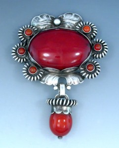
Early Jensen Arts and Crafts Brooch with Red Amber

Collectors and aficionados of vintage Jensen silver jewelry understand!  Beautiful to look at, beautiful to wear; the designs just have a look—elegant, understated, a patina and luster to the worked silver that is unique.

From the early Skonvirke (Arts & Crafts) buckles, hair ornaments, and brooches to the most abstract modernist necklaces,
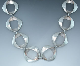
Henning Koppel modernist necklace

Henning Koppel modernist necklace

Jensen the man and Jensen the company have made major inroads into 20th and 21st century design.  His influence is far-reaching, his jewelry designs copied and reference all over the world, easily discernible in 1940’s-50’s jewelry from Europe and North America.

Jensen opened his workshop in 1904 and started making jewelry, concentrating on small items which required little initial investment.  Flatware and hollowware followed only later when he had acquired capital.  The 1st quarter of the 20 century was Jensen’s heyday, especially the decade of 1908-1918, a period during which he was so happy in his life and productive in his designs that he reached the apogee of his artistry.

Unusual in a workshop, Jensen gave free reign to his designer/silversmiths, designs were credited not only in Jensen’s name, but also in the individual artists’ names.  This created an atmosphere of kinship within the ranks, and an artistic freedom that made for the unbridled flow and exchange of ideas.

Unmistakable in their Arts & Crafts ornamentation, these early designs define what we have come to know as the “Georg Jensen Style”, his designs replete with leaves, flowers, grapes, insects and birds.  Set with inexpensive gemstones such as coral, amber, lapis, and moonstones, he created jewelry for the up and coming middle classes to enjoy and wear—pieces that were practical as well as beautiful—pieces that were also works of art. No mass production, each piece was made one at a time.

Jensen’s early designs are iconic, his early training as a sculptor evident in the treatment of the silver.  Hand-wrought and modeled like miniature sculptures, the silver was often worked with repoussé and chasing, the highs and lows of the metal glinting from the strikes of the hammer.  Jensen’s silver looks and feels unmistakable:  not only the working of the metal and the patina that vintage pieces achieve over time, but also the interaction of metal and light as light bounces off the leaves, tendrils, and curved silvery surfaces back to the eye.  One can see Jensen’s hand, his poetry, in the fashioning of the metal.

Although Jensen died in 1935, the company he founded has evolved and is still evolving.  Ownership, shareholders and partners have come and gone, as have the many designers who over the decades designed under his name.  The “Georg Jensen Style” lives on; many of his classic early designs are still produced, sharing gallery space with designers of the 1940’s, 50’s and 60’s he himself never met (Henning Koppel, Vivianna Torun Bulow-Hube, Nanna and Jorgen Ditzel, Astrid Fog, Bent Gabrielsen to name a few) as well as with contemporary designer/silversmiths such as Ole Kortzau, Anette Kraen, Erik Magnussen, Kim Naver, Regitze Overgaard, and Alan Sharff.

Importance, rarity, desirability:  is an older piece worth more than a new one?  Rarity depends on scarcity.  Older pieces with early hallmarks are desirable as are designs no longer in production.  The hallmarking system is more or less orderly, although marks can be a bit confusing. We value the older pieces for many reasons, but we also look forward to the future and to Jensen’s contemporary designs–tomorrow’s masterpieces.
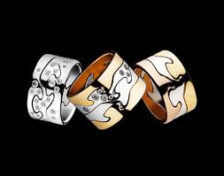
Contemporary Jensen:  White and Yellow Gold Fusion Rings

Contemporary Jensen: White and Yellow Gold Fusion Rings

References for this article:  “Georg Jensen Jewelry (Bard Graduate Center), “Danske Smykker” by Thage, “Georg Jensen Silversmithy—77 Artists, 77 Years” (Renwick Gallery 1980), “The Unknown Georg Jensen” (Georg Jensen Society) and “Georg Jensen” by Janet Drucker.